Design of the Times, an official contest and event of the Path to Purchase Expo, celebrates in-store displays and digital activations, and recognizes their role in an enhanced shopper experience.
Great Northern Instore won 14 awards at the 2017 event, including two Gold winners. See them all here:
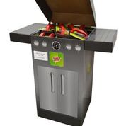
Gold: 3M Scotchbrite® Grill Scrubber Dump Bin
As a seasonal item, the merchandiser needed to grab consumers’ attention to promote scrubbers for their grills. Our team used the unique shape of a gas-grill as a structure for the dump bin. The differentiated shape stood out from the other displays while easily connecting the shopper to how the product is used.
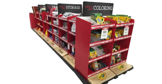
Gold: Michael’s Back-to-School Campaign
Michael’s needed a better way to execute their in-aisle seasonal section of the store within their multiple store footprints. The Instore team’s solution used a bold red color, header signage and overall impactful display size to command attention in the store. Clear, concise, contrasting signage and product identification footers helped the consumer easily navigate the display. Easy-to-shop wide shelves made product selection easy.
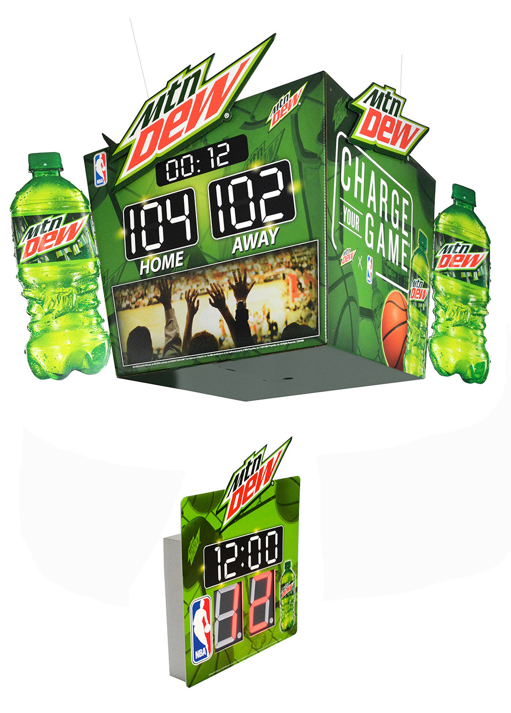
Silver: Mountain Dew NBA Scoreboard and Countdown Clock
Dew and the NBA were teaming up once again to bring consumers another charged up season. Project objective was to develop impactful Mountain Dew/NBA point of sale signs for the convenience store channel. The ultimate goal was to promote the sale of single serve beverages. The challenge to "painting the store green" was an all-encompassing charge to develop exciting promotional Mountain Dew NBA elements for all areas of the store including: window, cold vault, ceiling, wall, counter and shelf. It's all about reinforcement of the brand.
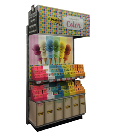
Silver: 3M PostIt Treat Yourself to Color Endcap
Color drives decision-making when it comes to purchasing Post-It notes. This display used an ice cream theme that would appeal to multi-generational shoppers. The goal was to make it easy to shop and easy to understand. A strong, clear, impulsive price point with well-organized products made this display a huge success at retail.
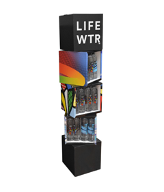
Silver: PepsiCo LIFE WTR Stacked Cube Display
PepsiCo wanted a bold merchandiser to launch its premium-priced bottled water – LIFEWTR. Our job was to create a merchandiser that would command shopper attention while capturing the artistic qualities of the brand. The solution was a unique, stacked cube structure that boldly connects with the shopper through its shape, black & white header, and bold designs where each cube doubles as a canvas for featured artwork. Shoppers are then drawn to the impactful bottles that are housed in the display.
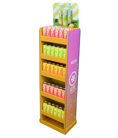
Bronze: IZZE Hutch Display
The IZZE design needed to be impactful, highlight two new brands, and stay relevant in-store for three promotional cycles. Consumers interested in this type of product are looking for new, refreshing experiences, and high quality ingredients. To break through the clutter at retail, the designers used a bold orange color that signals energy and freshness. Natural elements, such as grass, and bubbles were used to indicate refreshment to the shopper to make this an engaging design.
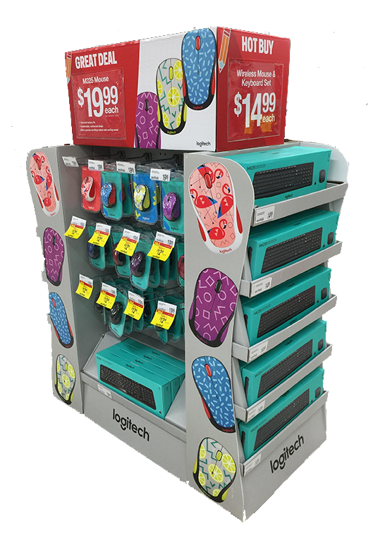
Bronze: Logitech Office Depot Back to School Half Pallet
The Back-to-School display required an over-sized half pallet, 4-sided display that featured a different product mix, price points and messaging on all four sides. Large, bold graphics of the products clearly showcased the brand and products during this busy time at retail.
Bronze: Callaway Chrome Soft Golf Ball Merchandiser
The Callaway display needed to feature two products for two different types of players. Using a bold color pallet with red as the primary color and a contrasting white for the second product, combined with an octagon shape, made this display standout at retail. The design connected with shoppers through large golf ball images on the header panels and clean Callaway logos on the short sides of the octagon. Cantilevered shelves presented the packages clearly to the shopper, making it easy to grab, learn more and place in their cart.
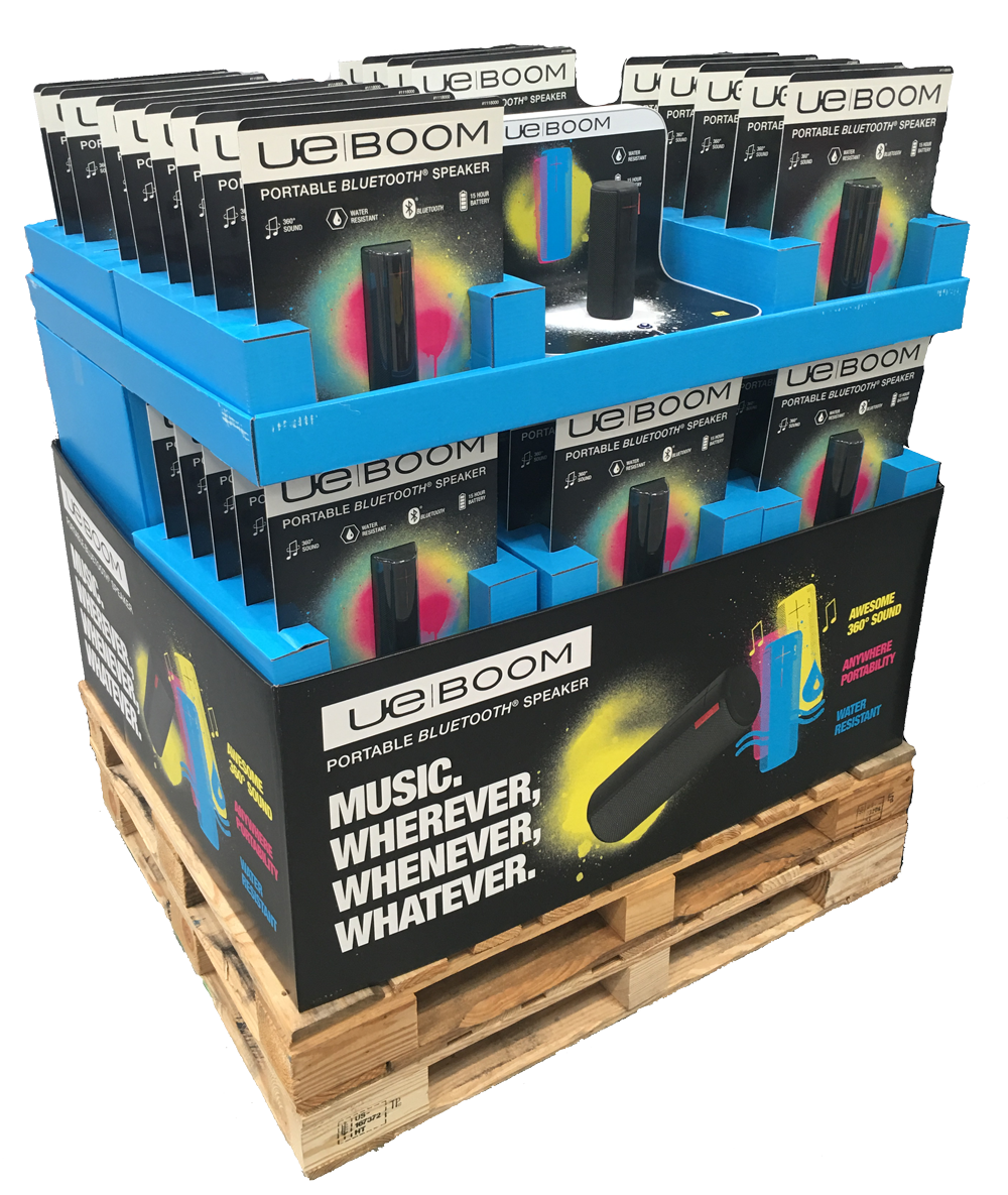
Bronze: Logitech Ultimate Ears Boom Pallet with Demo
The objective was to develop an entire pallet solution that included trap packs (blister cards) that were engineered to prevent theft and the system of trays to merchandise the packs. The display also included a Logitech demo unit to allow the consumer to hear the sound quality and see the quality of the product out-of-package. Bold colors were used to help attract attention, primarily with the millennial target market.
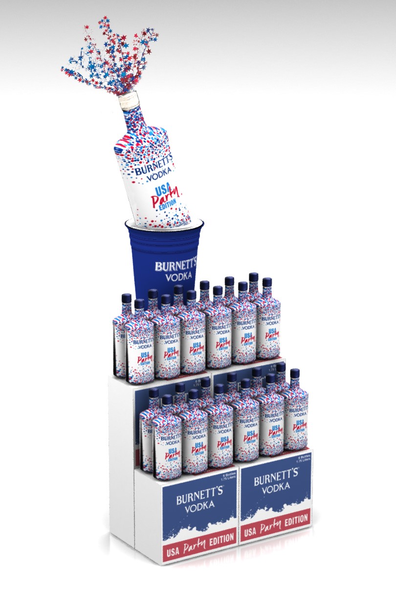
Bronze: Burnett’s Red, White and Blue Summer Display
Using a patriotic, summer theme to celebrate the holidays, this design captured the party spirit! Specialty, cutout graphics made this display really pop to drive sales at retail. The ‘Summer Fun/Party’ spirit was supported by the Special Edition packaging and bottles, as well as the red, white and blue color scheme and a confetti element.
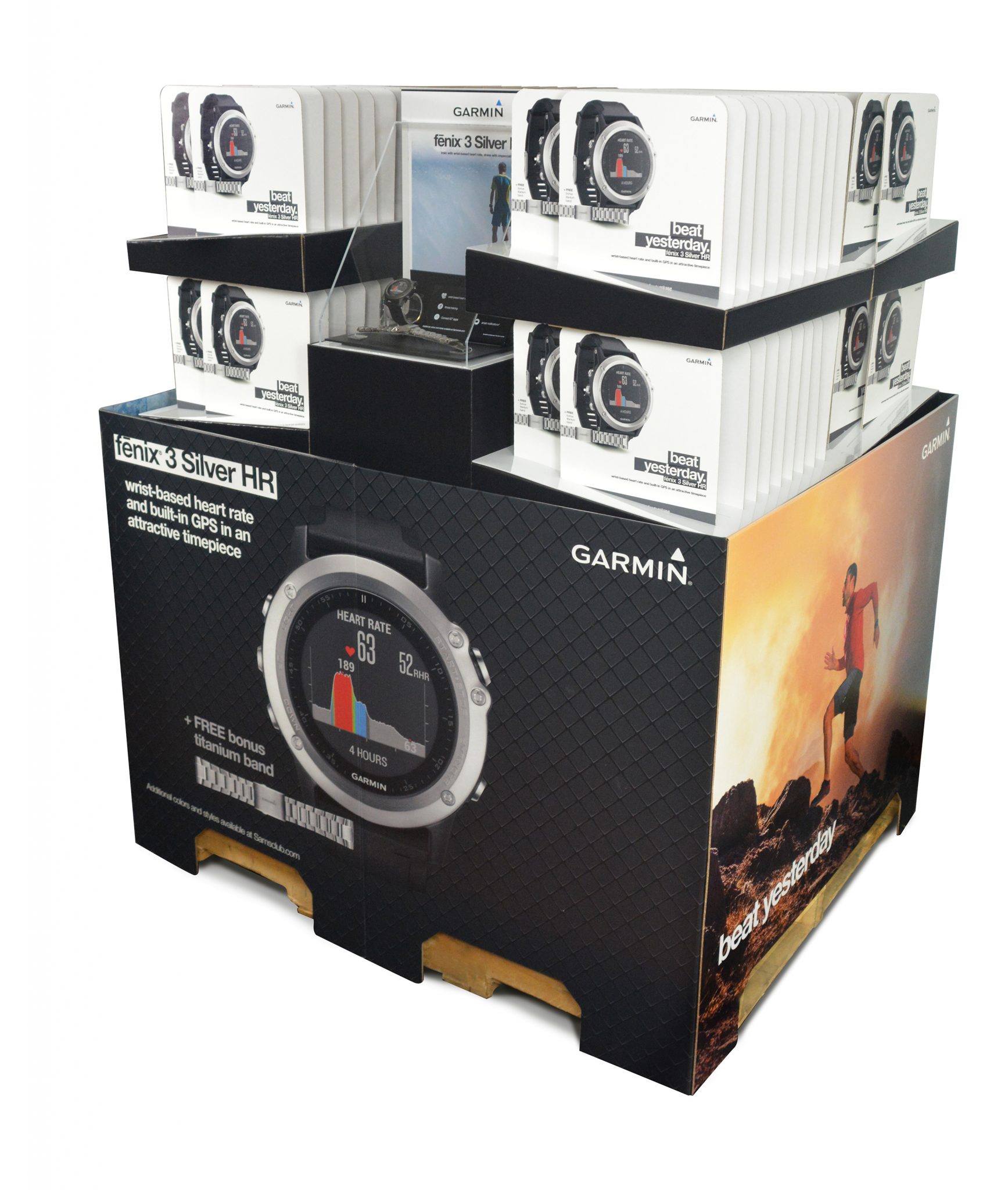
Bronze: Garmin Fenix 3HR Titanium Sam's Club Pallet
Garmin wanted a club store pallet solution that would highlight its new Smart Watch. Pull cards would be on the pallet (versus actual product) due to the high price point. The challenge was to convey the high-quality product, showcase the product, and highlight the value for the store club member. The solution included bold litho-mounted imagery of the watch and value-added messaging that were clearly displayed. Clean pull-cards were presented in unique wedge-shaped displays that were topped with high-end central material (rather than corrugate) to create a unique experience the shopper.
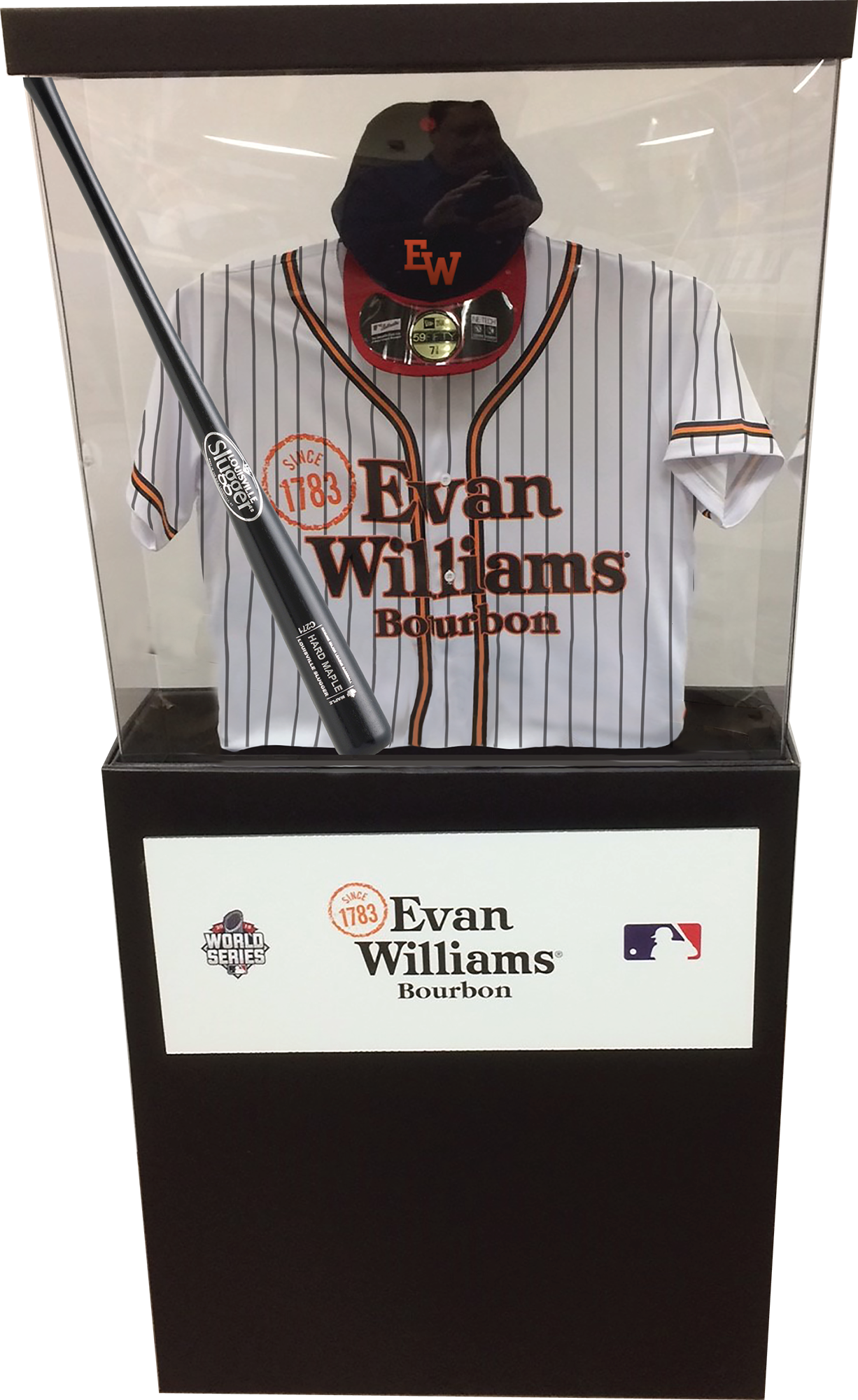
Bronze: Evan Williams MLB World Series Floor Stand
The objective was to develop a premium, impactful display to announce Evan Williams Bourbon as a proud sponsor or Major League Baseball in 2016. The display needed to reflect the quality of the brand, targeting both men and women bourbon enthusiasts. The unique display design of a trophy case with an authentic baseball jersey, hat and bat created a visual interruption that stops the consumer in-store. The giveaway of the jersey, hat and bat reinforced the promotion. The execution was customized for each marketplace to make a further connection – Royals gear in Kansas City, Reds gear in Cincinnati, etc.
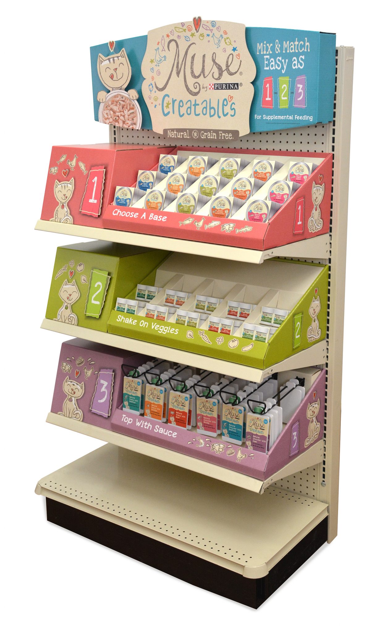
Bronze: Nestle Purina Muse Creatable End Cap
The project required an on-shelf solution for an endcap, that clearly communicates the Creatables product proposition (what Creatables is, how it works), key communication elements (Muse brand, natural, grain free, communicates taste experience and variety), and is not only attention grabbing but also distinctively stands out within the Pet Specialty retail environment. End cap needs to work across all unique end cap sizes and meet PetCo requirements.
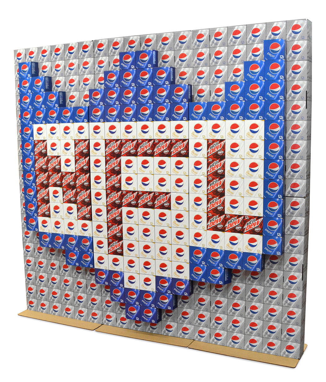
Bronze: Pepsi NFL Product Wall
PepsiCo distribution teams have made giant, seasonally relevant case-stack displays at mass and grocery that highlight their brands and make “images” using various products. They take lots of time, can have safety concerns, and product is then scrapped at the end. The project objective was to develop a solution that would replace the time consuming task of building case stack promotions, while maintaining the visual impact of these creative executions.
Check out our Display Awards page to see a summary of all the awards we have won over the years.


