Have you ever wondered what color makes people want to buy certain products? Color marketing is a powerful tool for merchandisers and consumer packaged goods (CPG) brands. Learning how to harness it for your brand and retail marketing can significantly impact your bottom line and in-store customer experience.
Table of Contents:
- Importance of Color in Retail
- How Do Colors Influence Shoppers’ Emotions?
- How to Choose Colors for Your Retail Displays
- Other Aspects of Retail Design That Influence Shopper Behavior
The Importance of Color in Retail
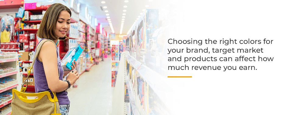
Color influences perceptions and behaviors in surprising ways. Choosing the right colors for your brand, target market and products can affect how much revenue you earn. In the store environment, color is essential for:
1. Brand Recognition
Color has an incredible ability to link your product to the rest of your branding. Color alone increases brand recognition by up to 80%, according to the University of Loyola, Maryland. On store shelves, a recognizable color instantly jumps out at consumers.
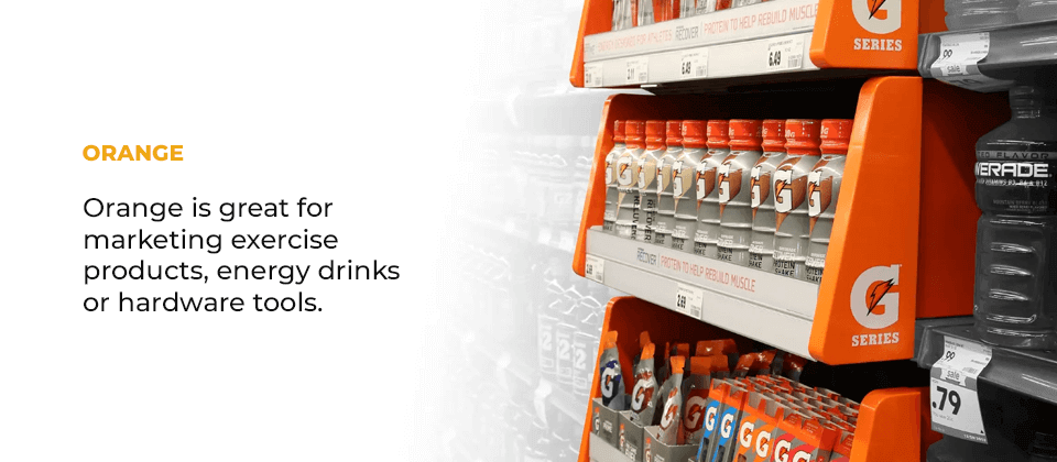
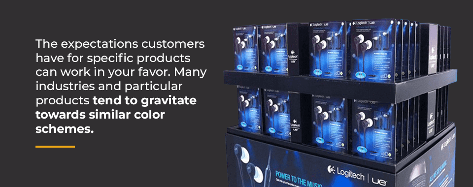
For example, Coca-Cola’s signature red makes their presence instantly known in soft drink aisles and soda fountains at restaurants. In the world of retail displays, you can see the power of color in some of our recent client work. Our packaging and display designs for Logitech leverage their distinctive blue. We also took advantage of Gatorade’s highly visible orange and white to command shoppers’ attention through in-store displays.
Even a small color variation can muddy brand visibility. That’s why the world’s top brands have strict color consistency guidelines. A product branded with the color blue will use the same blue in commercials, social media posts, packaging and retail displays. Maintaining consistency is challenging since colors appear differently on screens than in print, and different print methods, such as litho, flexographic, or digital, can have variances. Your display manufacturer must carefully plan any print job for appropriate color matching in the printed designs.
2. Product Discovery and Differentiation
Colors command attention. Consider how much more eye-catching a full-color magazine is than a black and white newspaper. Some colors naturally draw the eye, especially red and orange. Any bright or unusual color can attract more attention to your product.
Using the right colors helps some brands break through the noise of a crowded retail aisle and create differentiation. If your competitors use bright colors, stark black packaging and retail displays can differentiate your product. On the other hand, some product categories use mainly grays, blacks and whites. A whimsical color scheme with bright colors or pastels may help your product stand out.
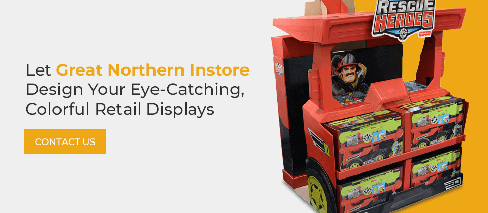
Brands also use colors to differentiate between products in their collection. Hair care and skin care brands might use different bottle colors to indicate which products belong to the same line. A color code like green for straight hair, red for wavy hair and purple for curly hair make it easy for shoppers to find shampoos and conditioners among a brand’s many offerings. Great Northern Instore incorporated product color-coding into a display for 3M Command, helping shoppers to find the products they need easily.
3. Influences and Associations
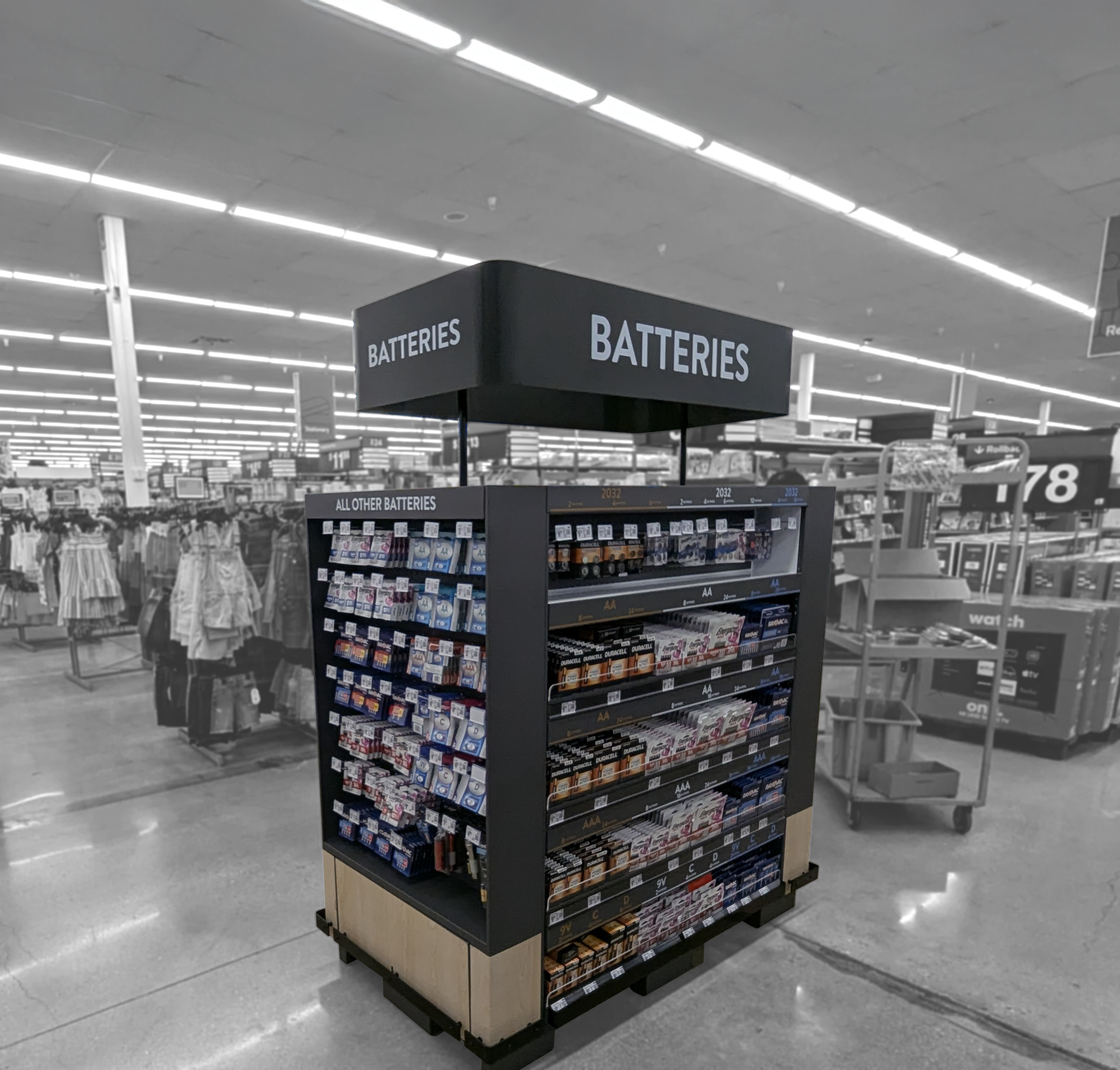
Color can also play on shoppers’ associations to help you sell more products. For example, some color schemes project luxury. A heavily black display, alongside a white, silver or light accent color, can instantly add sophistication to a product display. That’s one reason why many tech products, cosmetics, perfumes and high-end alcoholic beverages gravitate toward black.
Each color has a distinct set of common associations and cultural influences you can use to your advantage. It’s smart to be aware of these associations as you select colors for your products. In one context, red can represent love and passion. In another, it can invoke a sense of danger. Some brands and products may strive to incorporate these associations, while others may want to steer clear of them.
4. Holiday Marketing
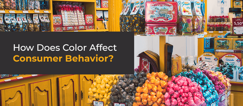
Another benefit of using colors in retail is the ability to align your products with seasonal promotions. It’s easy to see these color marketing tactics in action by studying candy brands. As Valentine’s Day approaches, the candy aisle is filled with red and pink displays. In anticipation of Easter, these brands adopt pastels. Around Halloween, they swap in orange, black, purple and green. Leading into Christmas, the colors transform into red, green, silver and gold.
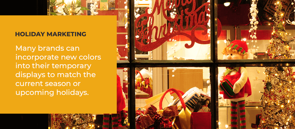
Many brands can incorporate new colors into their temporary displays to match the current season or upcoming holidays. Food products, especially those that could be used for a barbeque, can take advantage of red, white and blue displays leading up to the Fourth of July.
How Do Colors Influence Shoppers’ Emotions?
Shoppers’ feelings hold 1 1/2 times more weight than any other factor when it comes to decision making. Depending on their age group, shoppers make anywhere from 35%-49% of their purchases on impulse. Both of these facts make emotional responses highly coveted in the retail environment. Colors and emotions are intricately linked.
The impact of color in marketing is powerful. Specific colors, ranging from warm colors to cool colors, can evoke emotions that influence how we think and feel. For example, color can increase a shopper’s willingness to read packaging by 80%. Merchandisers can also use color psychology to elicit the emotions needed to trigger buying decisions and influence consumer behavior.
In the psychology of color, each hue can evoke different emotions. Let’s explore them for each color:
Red
Studies show red increases our heart rate. Increased heart rates can signal the adrenaline rush associated with danger. As a result, this color has an incredibly powerful effect on our emotions. What emotions does red represent? Red can represent the intense emotions associated with love. The color red’s physiological effects make it incredibly powerful for encouraging impulse buys. It’s used in clearance sales because it creates a feeling of urgency. Among the world’s largest retailers, 59% incorporate red into their branding, showing just how popular it is.
Since the color also represents blood and is highly visible, it’s sometimes used for safety. As children, we learn to link red with safety because of traffic lights and stop signs, and this association lingers into adulthood. First aid supplies can use the color red to take advantage of these associations.
Yellow
Another warm color, yellow is much more subdued than red while still attractive and attention-grabbing. Besides white, yellow has the brightest wavelength. It’s another popular color for clearance sales. In general, yellow gives shoppers feelings of warmth, cheerfulness and optimism. Yellow can also stimulate mental activity, heighten awareness and boost energy levels. However, overuse of the color yellow can give people anxiety.
Orange
On the spectrum between red and yellow, orange combines their associations. It plays off red’s energy and yellow’s optimism and happiness. It’s the color of sunshine and tropical paradise, which lets it evoke feelings of joy. It can also motivate people, invoking feelings of enthusiasm, determination, encouragement and stimulation. Orange is great for marketing exercise products, energy drinks or hardware tools.
Blue
As the color of the sky and the ocean, blue invokes feelings of calmness, serenity and tranquility. Because it provides a sense of relaxation and security, it can ease customers through a difficult purchase decision. One study found customers at a car dealership agreed to deals 35% more profitable for the dealership when negotiating in a blue room.
In contrast to red, which triggers increased heart rates, blue prompts the secretion of calming hormones. This helps slow breathing and lower the heart rate to support overall relaxation. Blue can also evoke enthusiasm, imagination, sincerity, spirituality and compassion.
Green
Green is the color of nature. As a result, it indicates purity, health and freshness. Its association with plants invoke feelings of growth and vitality. It can be invigorating and productive or gentle and relaxing, depending on the context. Since it reminds us of nature, it can also represent harmony and connection or work well when a brand that is promoting environmental and sustainability initiatives.
Purple
Purple is a bit unexpected when it comes to product marketing, giving people a sense of freshness and novelty. The color purple is associated with luxury and power, with a twinge of royalty. Bluer indigos can continue to evoke tranquility, while redder purples represent ambition and power. Violet can also remind us of wisdom, dignity, independence, mystery, magic and creativity.
Pink
Pink is much more gentle than red and has a non-threatening, tender appearance. It’s associated with childhood and youthfulness, which makes it a powerful marketing tool. It represents innocence, optimism and hope. Its associations with femininity can make it useful for marketing aimed at women and girls. However, some shoppers may be wary of the perceived “pink tax,” which could cause them to avoid pink-colored displays and products.
Black
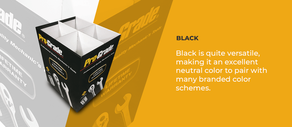
Black is quite versatile, making it an excellent neutral color to pair with many branded color schemes. When black is a more prominent feature of the brand, it can hold many meanings. It could represent elegance, sophistication, formality and power. It can also be a symbol of mourning, anger and grief.
White
Like black, white is elegant and also makes an excellent accent color for a branded color palette. As black’s opposite, white gives off feelings of purity, goodness and innocence — much like the emotions blue creates. Like snow or a blank canvas, it looks unspoiled, perfect or even sterile. It also represents newness and youthfulness.
Gray
As a combination of black and white, gray cancels out the associations of both colors. Gray is a true neutral. Like a cloudy day, it can invoke feelings of hibernation or a lack of energy. When used with other sophisticated branding elements, it can also represent maturity. It’s best as an accent rather than the primary brand color. Certain shades give us a sense of balance or calm.
How to Choose Colors for Your Retail Displays
Besides the emotional impact, the color scheme you choose should fit your brand, target market and offerings. As you select colors for your retail displays, consider:
1. Target Market
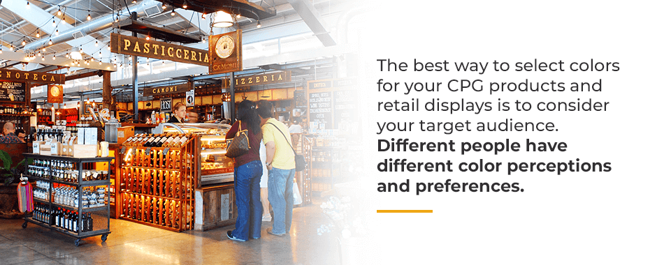
The best way to select colors for your CPG products and retail displays is to consider your target audience. Different people have different color perceptions and preferences. Think about your ideal customer and match colors to that person’s preferences, personality and identity. Consider many factors, such as:
- Gender: Is your ideal customer more masculine or feminine? Blue is well-loved by both males and females, with 57% of men and 35% of women listing it as their favorite color. Purple is a decidedly feminine color since 23% of women claim it as their favorite, while 22% of men say it’s their least favorite. While brown is often used for rugged, masculine brands, only 2% of men list it as their favorite color, and 27% say it’s their least favorite. In general, men prefer bright, vibrant colors, while women favor softer tones. Men are more tolerant of achromatic color schemes in shades of gray. Further, men prefer shades, or hues with black added to them. Women enjoy tints, which are colors with white added to them.
- Tone: While we usually associate tone with language, color can set the tone, too. A playful brand might gravitate toward bright pinks, oranges, purples, greens and yellows. A more serious brand might stick to tried-and-true colors like blue, black, white and red. An authentic brand might also choose blue for its associations with trust.
- Values: Another consideration is whether your customers value affordability or luxury. For example, 26% of people say orange is a cheap or inexpensive color, and another 22% apply these attributes to yellow. Black and purple project luxury.
- Age: Your customer base’s age can also play a role in your branding. Since white is youthful, it’s a smart choice for young adults or adults who are young at heart. Yellow is the first color infants react to, and pastels are typical for baby products. Products aimed at kids have brighter colors. Teens and young adults tend to enjoy contrast in color schemes, while older customers gravitate to blues and subdued, low-contrast, analogous color palettes.
- Energy: A subdued brand could focus on neutral grays, browns, blacks or whites. A more energetic brand might incorporate pops of color, like lime green or cherry red.
2. Industry Associations
The expectations customers have for specific products can work in your favor. Many industries and particular products tend to gravitate towards similar color schemes. Since these colors already have powerful associations attached, picking a display that matches expectations helps people find or accept your product in the retail environment.
For example, orange and yellow are associated with construction signage and equipment. Along with black lettering and graphics, these two colors make a great addition to a hardware or power tool display. Orange-flavored drinks or foods will also do well to choose an orange color scheme. A printer or ink cartridge display could take advantage of the black, gray and white or cyan, magenta, yellow and kohl (CMYK) color palettes the products are known for. Bottled water almost always features a predominantly blue or green display since these colors are associated with the fresh, clean water consumers expect.
Going against the grain can also work in your favor. Choosing an unexpected color can command attention in a busy marketing landscape. If your industry sticks to safe color schemes involving red, black, white or blue, going bold with neon green, hot pink or traffic cone orange can pay off. These colors might appear whimsical, modern, fun or innovative. They can contribute to a reputation as a brand that breaks the mold.
3. Brand Aesthetic
The colors you use on your display don’t need to match your branded color scheme exactly. This is especially true with seasonal displays, which adopt the colors associated with upcoming holidays. However, your brand aesthetic certainly plays a factor.
Black Friday sale displays usually include the colors black, red, white and gold. Black is an excellent choice because it matches most branded color palettes. If red is part of your branded color scheme, you’ll probably want to match your display to your exact shade of red. Other brands accent their display signage in gold, especially if the product is more feminine or luxurious.
Other Aspects of Retail Design That Influence Shopper Behavior
Besides color, many factors influence consumers in the retail environment, including:
1. Location and Organization
Among retailers, 37% say end-of-aisle displays drive the most sales, while only 14.8% say the same for displays within aisles. That’s because endcap displays are visible to anyone who passes by, while customers only see shelf displays if they walk through the section.
Within a display, organization also plays a role. Products need a logical organization to help customers find what they want. It’s helpful to organize skin care products in the order they should be used. You might even use the display to describe the steps in the routine. Organize the products so they take up more room while staying in neat rows and columns. Work with your retail partners to keep the displays stocked and maximize visual appeal.
2. Novelty
Novelty has a few roles in retail. First, it’s critical to keep things fresh. Using temporary corrugated displays offers the opportunity to change displays regularly. This lets you play off of seasonal sales and current trends. Introduce new display designs to prevent regular shoppers from losing interest in your products over time.
Novelty can also mean drawing in shoppers with unusual designs. Incorporate unexpected shapes, graphics and messaging to stand out in a busy store.
3. Imagery
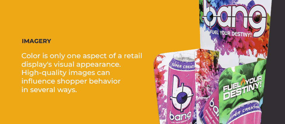
Color is only one aspect of a retail display’s visual appearance. High-quality images can influence shopper behavior in several ways. A picture of an attractive model using a beauty product can sway a shopper through visual aid. Other times, using a relatable model, such as a cartoon character for a toy display or a person who looks like the target audience, convinces shoppers to buy.
4. Messaging
The largest text on a display is what customers will see first. The content of the message will influence whether a shopper chooses to browse further. Consider the unique value your product offers and craft messaging around that. Does it come at a lower price point, or does it have high-end appeal?
5. Interactivity and Digital Displays
With how much time people spend looking at screens, digital displays can also attract attention and impact consumer behavior. They can scroll through more information and exciting imagery. In-store displays also offer interactivity, which lets customers build a stronger connection with a product. Include a screen or tech product shoppers can fiddle with. Or, if you’re selling perfume, consider a display with a sample bottle and branded tester cards.


